Do you know there's an exciting new features of Looker Studio that will revolutionize the way you visualize your data? In this article, we will dive into the latest updates and learn how to create scorecards with progress bars, enabling you to take your dashboard to the next level and impress your clients with stunning visuals.
Creating a Scorecard
The first step in creating a scorecard is to familiarize yourself with the basic process in Looker Studio. You have two options to get started: the fastest way and the more conventional method.
The Fastest Way to Create a Scorecard
Simply drag and drop one of the metrics onto our Canvas in Looker Studio, and the scorecard will be created automatically.
This quick and easy method is perfect when you want to create a basic scorecard fast! However, the field must be a metric (appeared in blue). Any other dimension fields would not work.
Conventional Method to Create a Scorecard
If you want to create a scorecard without the metric field, you can follow these steps:
- Click on "Add a chart" in Looker Studio.
- Select "Scorecard" from the available chart options.
- Click on the canvas and add a metric field or a dimension field to the chart. Note that dimension field would be aggregated based on the default aggregation level.
Setting Targets for Scorecards
Once you've created a scorecard, the next step is to set a target. This allows you to compare your actual performance against the desired goal.
Manual Target Setting for Comparing Performance
To add a target for a specific Key Performance Indicator (KPI), follow these steps:
- Go to the Property Panel on the right side of Looker Studio.
- Navigate to the SETUP tab to edit chart settings.
- Under "Other Comparison Options," select "Value."
- Enter the desired target value.
- For example, let's set the target as 5000.
Now, you'll see the comparison metrics against the target being calculated. However, if you notice, the comparison metrics shown in the scorecard is actually the growth rate. In the next step, we'll learn how to convert this growth rate into a progress rate with just a single click.
Dynamic Target Setting for Advanced Users
For more advanced users, Looker Studio offers the option to pull target values dynamically using metrics. This provides greater flexibility and automation in your scorecards.
Enhancing Scorecards with Progress Bars
A progress bar adds an extra layer of visual appeal to your scorecard, providing a quick snapshot of your progress towards the target. This is particularly useful when comparing actual figures with your budgeted or target figures.
To enable progress bars in your scorecard chart, follow these steps:
- Tick the box "Show as progress" in the scorecard chart setup.
- Now, you'll have a scorecard with a progress bar, along with the target value and the progress percentage.
- Previously, this percentage was calculated as the growth rate, but with the progress bar enabled, it represents the progress made towards the target.
Feel free to resize the chart to ensure that the progress bar fits neatly within the scorecard.
Customizing Progress Bars
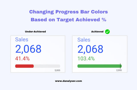
Looker Studio allows you to customize the color of the progress bar based on your specific requirements. By default, when the target is met, the progress bar and percentage are shown in green. When the target is not met, they are shown in red. However, you can easily change these colors based on your preference.
Altering Progress Bar Colors for Different Trends
To customize the color scheme based on different trends, follow these steps:
- Go to the Property Panel in Looker Studio.
- Navigate to the STYLE tab.
- Under "Comparison fields," edit the color of the downward trend to a different color, such as purple.
By modifying the color for upward or downward trends, you can create a more visually appealing scorecard.
Changing Colors for Target Achievement
In addition to customizing the color scheme for trends, you can also change the color of the progress bar when the target has been achieved.
- Modify the target value in the scorecard to demonstrate the example.
- Let's change the target to 2000.
- Now, observe that the color changes to green, which is the default color indicating target achievement.
- To change this color, follow the same steps as mentioned earlier and select a color from the palette or choose a custom color.
Remember to change the target value back to its original value after the demonstration.
Bonus Tip: Circular and Radial Progress Bars
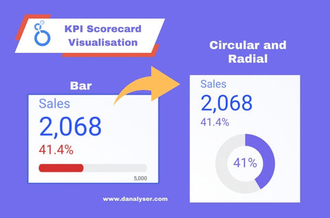
If you want to take your scorecard game to the next level and add a unique touch to your data visualization, Looker Studio offers the ability to transform your scorecard into visually striking circular or radial progress bars.
To achieve this, follow these steps:
- Change the style settings under Progress Visual.
- Change the value from bar to circular.
- Resize the scorecard as needed.
By following these steps, you can create visually captivating circular or radial progress bars that will truly captivate your audience.
Conclusion
Congratulations! You've learned how to create scorecards with progress bars in Looker Studio. We covered everything from the basic creation of scorecards to customizing progress bars and even turning them into circular masterpieces. Additionally, you can further enhance your scorecards by adding conditional formatting to highlight specific thresholds.
If you found this tutorial helpful, please give it a thumbs up and subscribe to our newsletter for more exciting content. Feel free to watch our video tutorial on this topic for additional guidance. Thank you for reading, and we look forward to seeing you in the next video!
Recommended:
In the next video, we will take a deep dive into Looker Studio's scorecards, revealing their practical applications and how they can enhance your reporting efforts 🔥
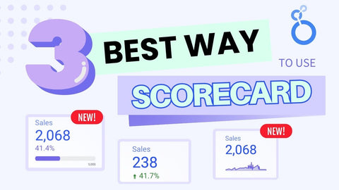
Join us as we explore three key use cases that will revolutionize the way you analyze data. We'll show you how to:
✅ Track progress toward targets (which we have covered in this article).
✅ Gain insights into growth over time.
✅ Leverage the new trend line feature.
Click the image to watch now! Enjoy :)